How to use Data Studio + Google Analytics to show 'through-traffic' for a content type

Overview
Anyone who has some experience with Google Analytics might hear about Data Studio as something that can extend or add to GA and think “Why would I ever want to add more stuff to GA? It already has way too much stuff for me to handle.” This thought is followed by a mental montage of endless menus, columns, tabs, and terminology, and the inability to remember how to do whatever it was you did last time.
This is the beauty of Data Studio: you start with a completely blank canvas and only add the things you need. Then you can share those things with others without having to send them a video tutorial first. And re-use those things next month or next year.
The “thing” we’re working on now, a through-traffic report, involves a client that wants to improve the prominence and flexibility of the “article” content type on their site - this will address overall goals of making the site more dynamic and informative. Before we dive into ideas for improvement, we want to study how users currently behave around the article content type. Namely, where is traffic on article pages coming from and where does it go.
This approach might bring to mind the “Behavior Flow” section of Google Analytics, which visualizes through-traffic data patterns around pages or groups of pages (see below).
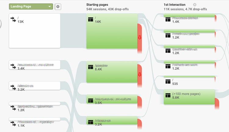
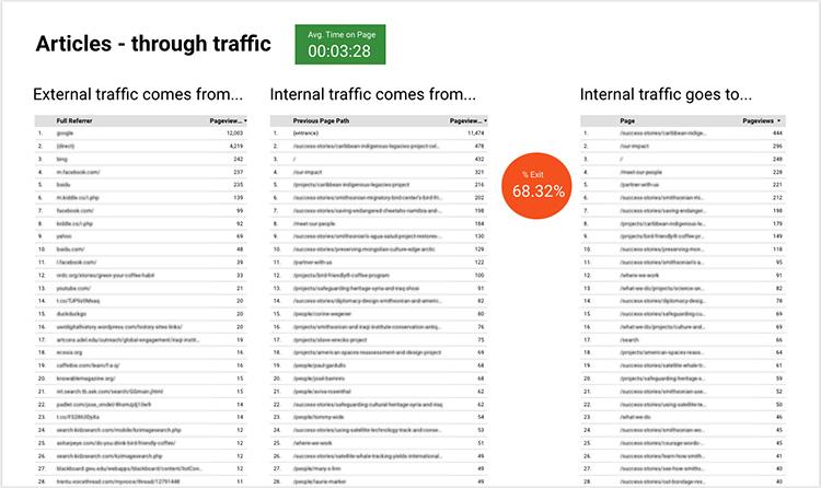
The problem is that it’s buried within the GA interface, and it’s just more complicated than what we want. So let’s build exactly what we want: a report with a list of pages (both external and internal) that article viewers are coming from, and a list of pages (internal) they are going to after they view the article. We’ll do this with three tables:
- Where external traffic to article pages comes from (referrers)
- Where internal traffic to article pages comes from (prev. page path)
- Where internal traffic from article pages goes to (prev. page path - reversed)
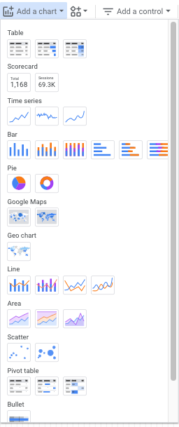
After we’ve created a new Data Studio report and connected it to the right Google Analytics data source (tutorial for that here), we begin: the first thing we want to add to our blank canvas is a chart to hold the data. The screenshot below shows the popup options you get from the “Add a chart” button in the toolbar. There’s a lot! But we just want a plain old table - the first option on the left.
The chart comes pre-populated with a dimension (page title) and a metric (average time on page). With the table selected the settings are displayed and can be manipulated under the data tab on the right.
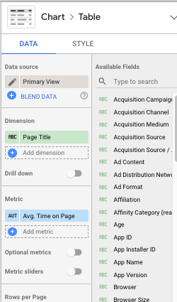
Click the “Add dimension” option in the settings pane and select “Full referrer” then click “Add metric” and select “Pageviews.” Finally, click the “x” that appears on hover next to the two pre-populated options to remove them.
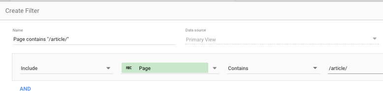
Now we have a simple numbered table showing referrers and pageviews. The final step is to filter the table so that it only shows referrers for the article pages. Scroll down to the Filters section of the data settings and click “Add a filter”. Since no filters are created yet, you’ll need to click “Create a filter” at the bottom of the empty filters pane.
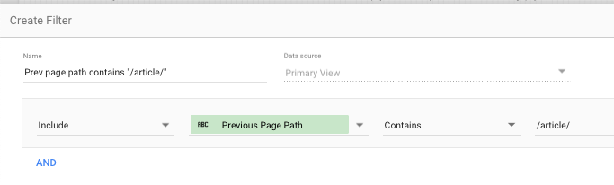
All of the articles on our client’s site have the “/article/” page path segment so we’ll use that to filter the content. Make sure to name the filter something intuitive for possible use later on, and specify settings similar to those shown below:
You’ll see that the options for filters contain all the Google Analytics fields as well as the ability to create compound filters using “or” and “and”, but we don’t need that here. Once that filter is saved our first table is done. There are also many more options in the data pane such as the ability to change the number of rows in the table or the date range, both relative or exact.
To start the next table (where internal traffic to article pages comes from), we can do a simple copy/paste of the first table to retain all of the settings. The only item we have to change is the dimension, which should be “Previous page path” instead of “Full referrer”. Done.
For the third table (where internal traffic from article pages goes to), I first changed the dimension to simply “Page”. You may wonder why I didn’t change it to “Next page path” - I tried, but Data Studio doesn’t seem to offer that for some reason, so I created a workaround using the filter. Filtering by items that have “/article/” in their “Previous page path”, will give you a list equivalent to the “Next page path”. So my filter settings are as shown below, and again, the table’s only dimension is “Page”.
So we have our data displayed as we want it! Beautiful, right? No, it desperately needs some context if anyone besides me is going to lay eyes on it.
I’m going to label these tables as simply and non-technically as I can and add a few “scorecards” (individual stats) that are relevant. I want to put the overall “% Exit” stat for articles between the incoming and outgoing traffic since that is where it is relevant - I also want it on a red circle as a further visual cue - and Data studio provides the tools and functionality to easily do this within its layout and design functionality.
It’s still visually very basic – if you need to create impeccably-designed reports, Data Studio has the tools for that too.
Moving forward I can create new pages in this report, switch up the content type, add metrics etc., make a copy and re-use it with a different data set, and most importantly, click the familiar Google share button in the upper right to share just as you would a Google Doc.